News
Fresh Pixels: Daggers of Dagon
06.11.2018
Please welcome my newest personal work to the online gallery! The 1985 arcade classic Shao-Lin's Road inspired this mockup, which I imbued with an Ancient Near East theme. Outside of my visit to the Morgan Library's Antoine de Saint-Exupéry exhibit in 2014, I have never felt closer to Le Petit Prince than when I was drawing the sheep sprite.
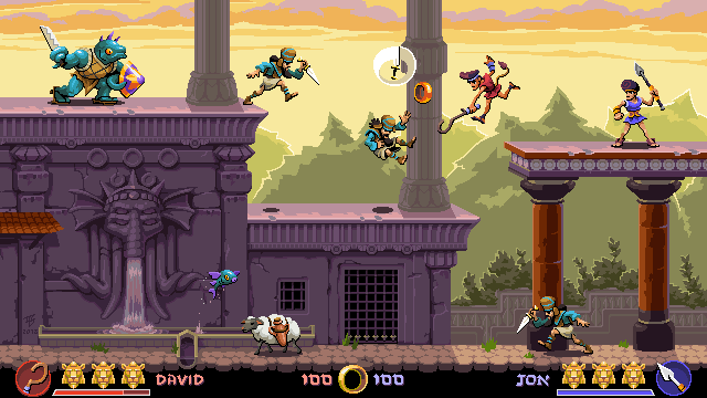
The resolution upscales cleanly to both 720p and 1080p, but some of the pixel essence is lost at this granularity. For an actual game, I would opt for a smaller screen size, even if it needed a border for HD display.
In terms of technique, even banding and double pixels can be useful to the rendering. I wasn't feeling anti-aliasing... so I didn't.
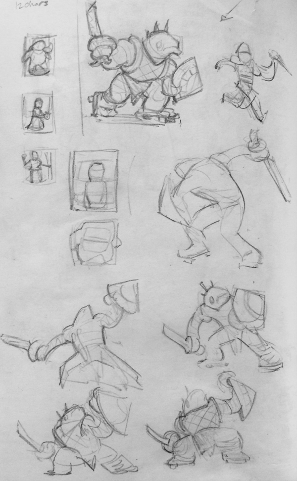
Here's a sample page of pencil studies I made in preparation for this piece.
Thanks for stopping by!
Shakedown Hawaii
09.12.2017
![]()
(Logo created by another artist)
Over the past year, I've worked with Vblank Entertainment on Shakedown Hawaii, the spiritual successor to the 2D Grand Theft Auto titles of yesteryear. Most of my tasks involved animating the vehicles, but I also had the opportunity to help out with some environment tiles, cut scenes, and UI visuals.
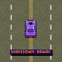
(0 to 60 pixels in 2 seconds!)
Perhaps my infrequent rate of posting can be offset by indulging you with a detailed dive into some aspects of my process.
I edited some of the weapon icons, improving both readability and their consistency with the established art style. In the screen shot below, you can see the sci-fi gun I drew from scratch as well as my edited versions of the assault rifle and the minigun.
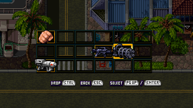
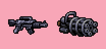
Here are the originals for comparison. The icon size restriction presents an interesting set of challenges. Filling the available space gives me more detail to work with, but can distort the weapon's proportions (e.g. snub-nosed rifle syndrome). Plus the arsenal should feature a variety of sizes to maximize the visual interest.
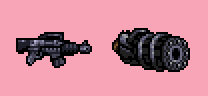
I made the minigun's silhouette more distinctive, extending the handle on top upwards to create a small window of negative space. When rendering its form, I accentuated the highlights on all six barrels to bring the design closer to its real world inspiration.
The HUD icons for the empire-building component of the game posed a more difficult challenge for two reasons: they represented abstract ideas and the size of each was extremely limited (16x13 pixels). From left to right, they are: cash in corporation, assets in corporation, annual profit, personal salary, and personal cash.
The icons' inner frames tended to crowd and overpower the designs they encompassed. Furthermore, the icons served not as interactive buttons, but rather as symbols to provide context for their associated numeric totals. To simplify the messaging, I removed the inner frames. With only the thinner single frame remaining around each indicator, the icon colors still needed brightening to promote additional readability. Beyond the rendering, I didn't alter the designs of the first three categories: bank for corporate cash, buildings for assets, and a bar graph for earnings.
Although the currency symbols within the remaining two designs helped to communicate their concepts, they felt redundant considering their reuse as units of measurement. I relied on concrete objects instead, eventually settling on the paycheck envelope for salary and the money clip for cash that the player character is carrying. I also experimented with wallet designs, but the money clip struck me as more appropriate for the game's theme of organized crime.
The game is slated for release later this year on Switch, 3DS, PS4, PS Vita, and Steam. Add it to your wish list so you don't miss out on the pixelated mayhem!